Luton Town FC Design Task
An opportunity to test my Graphic Design skills in football media with Luton Town Football Club as part of a design task
Briefs
1. Create a matchday visual to be posted on social media for an upcoming match.
2. Create artwork for social media promoting the upcoming Black Friday sale.



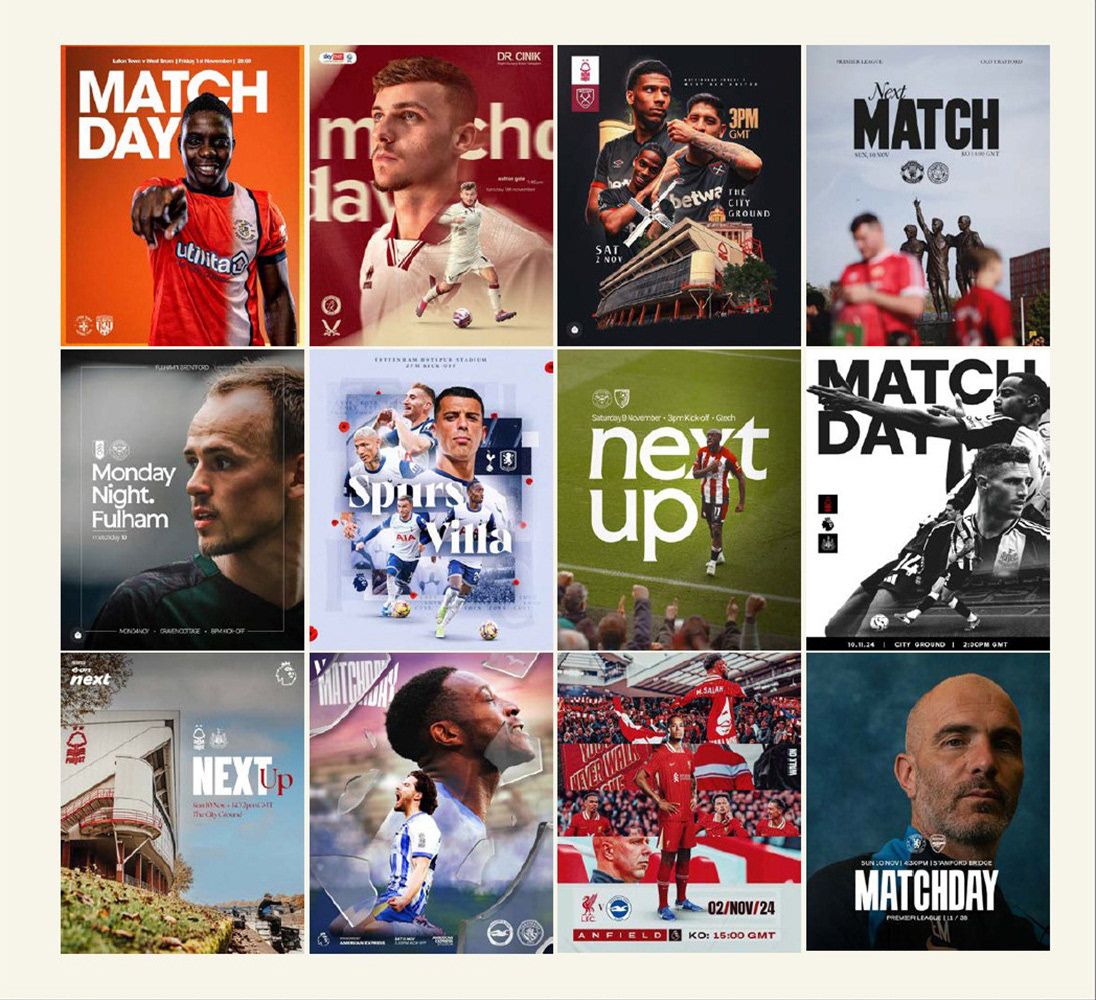
Research and ideation
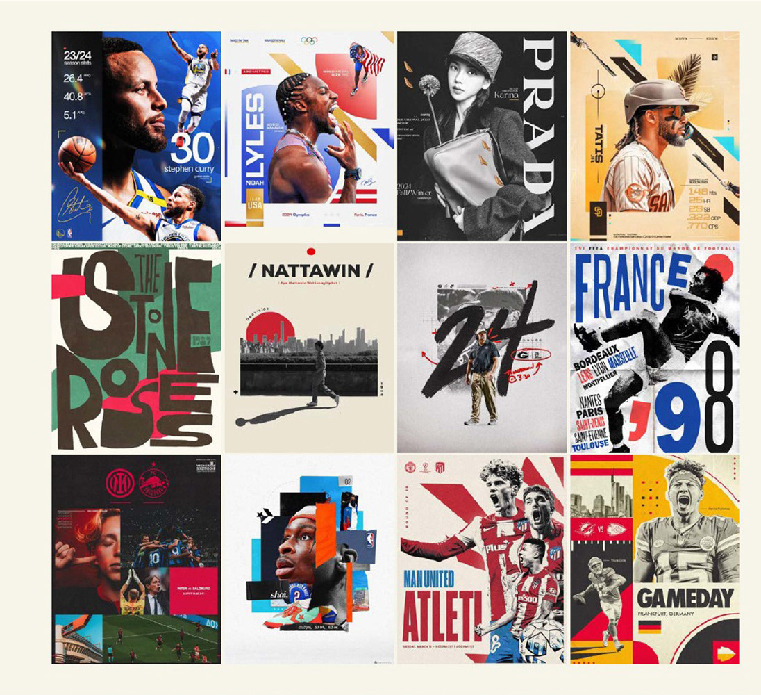
– Identified key trends in football club design for the 2024/2025 season, including bold photography, strong fonts for titles, and clean, clear layouts.
– Explored design inspirations beyond matchday, taking advantage of football clubs' recent creative refresh for future innovation.
– Explored design inspirations beyond matchday, taking advantage of football clubs' recent creative refresh for future innovation.
sketches
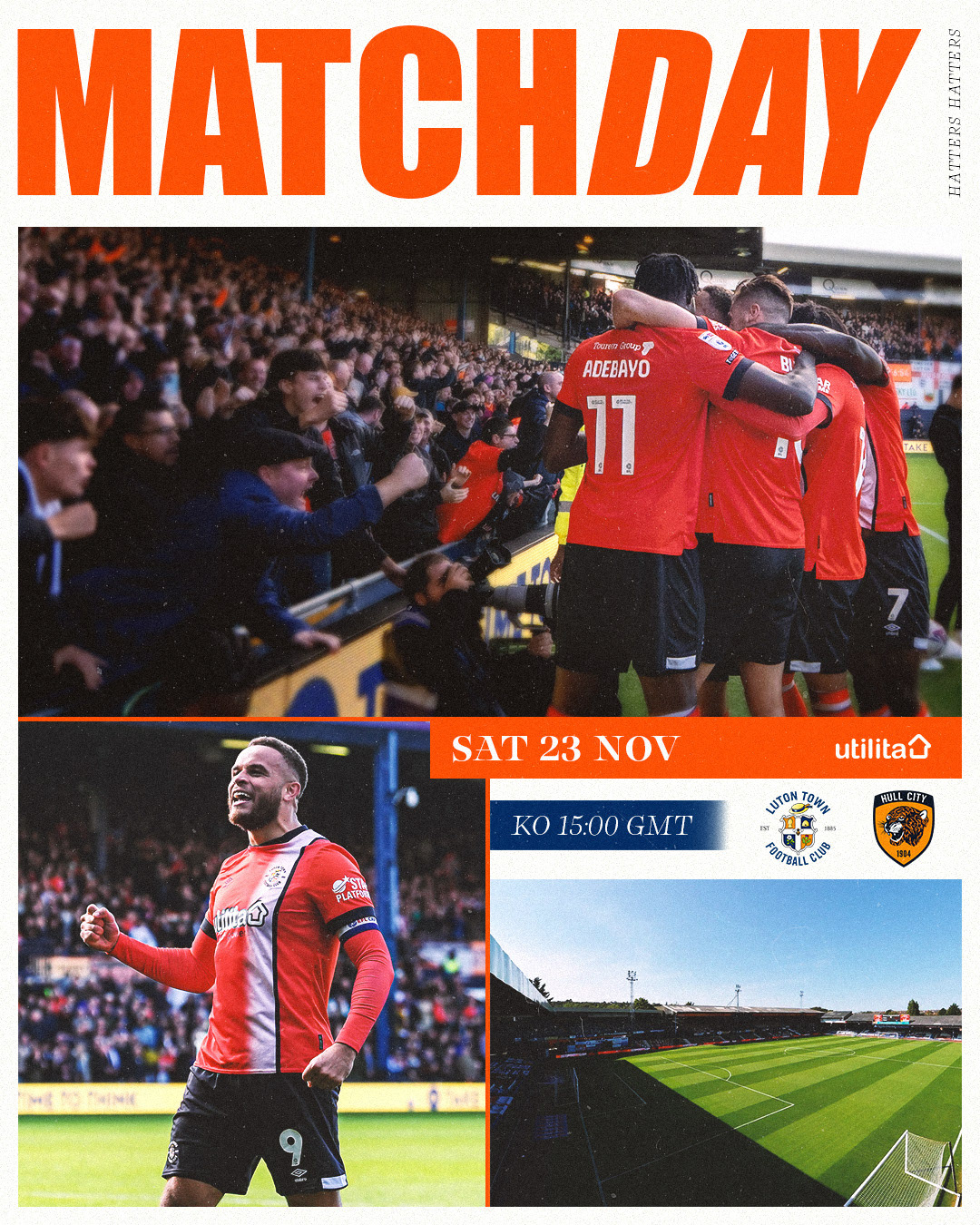
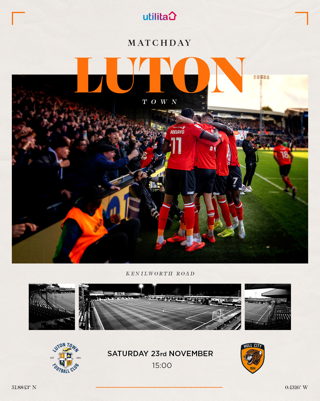
– Explored two directions for matchday designs: one focused on strong photography with complementary typography, and the other embracing creative, refreshed visual identities.
– Sketched rough ideas to offer variety in styles and test different design principles.
– Sketched rough ideas to offer variety in styles and test different design principles.
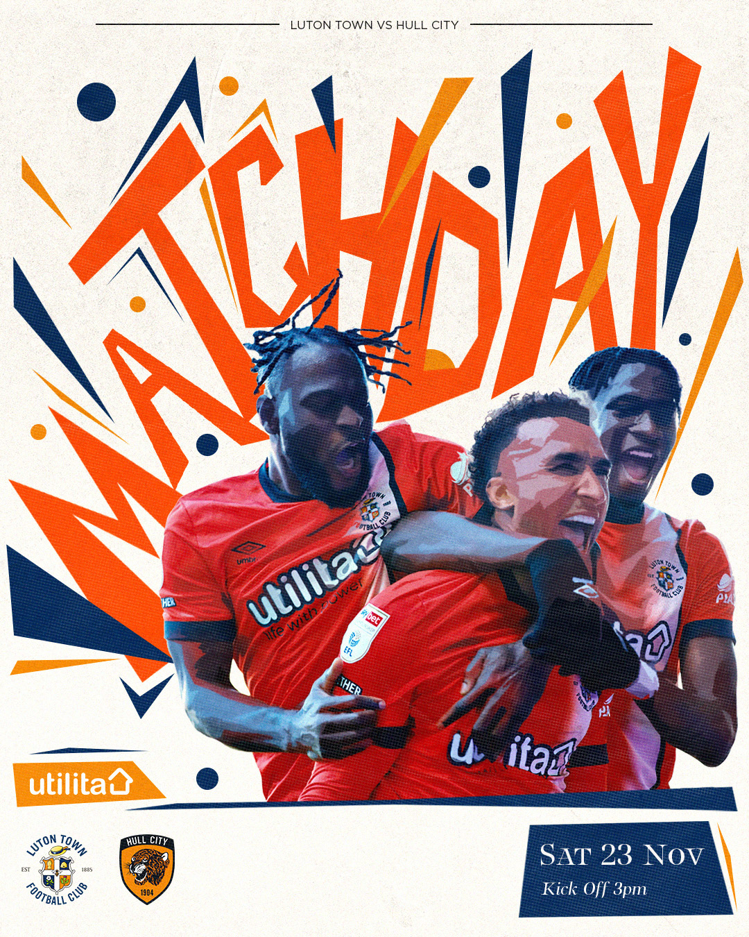
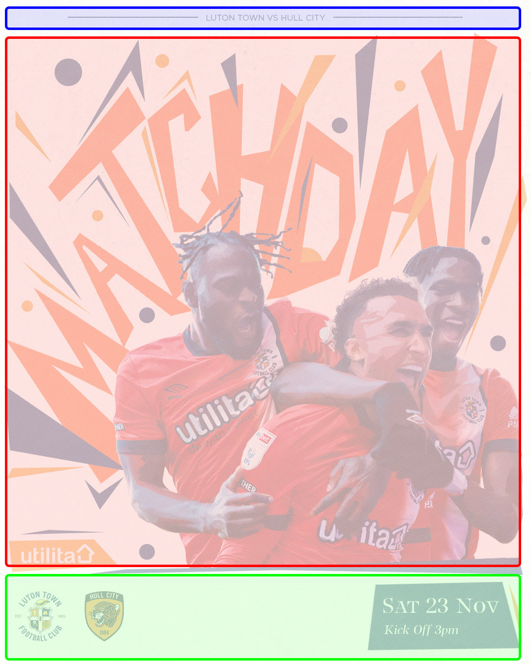
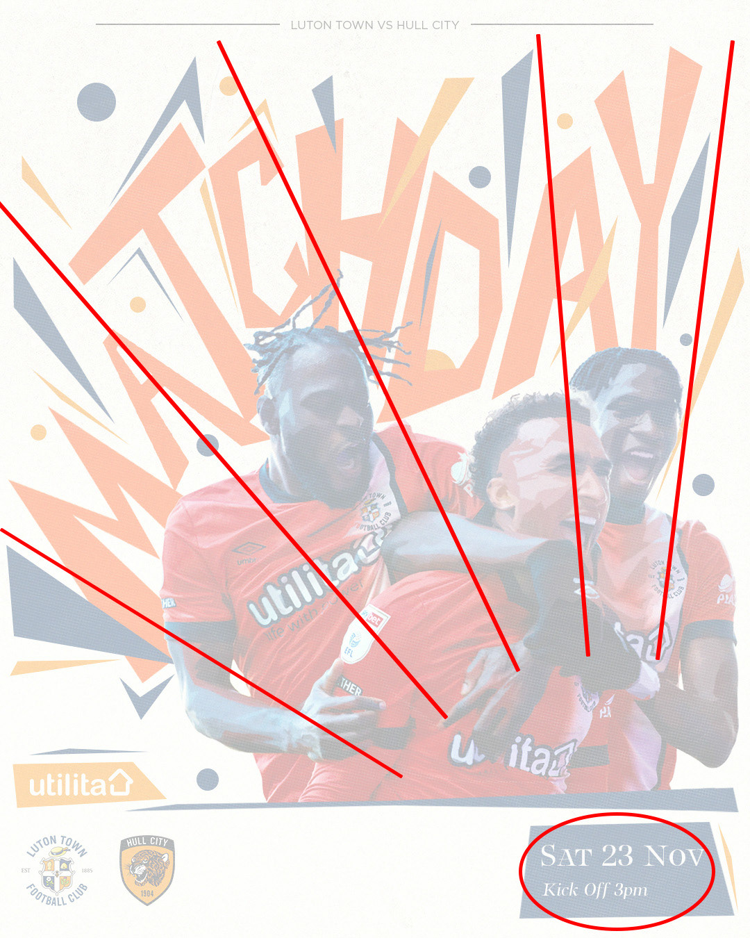
Option 1 featured a three-section layout: a central artwork to grab attention, a secondary section for matchday information, and a third section for balance, with design elements guiding the viewer’s eye to the most important details for effective communication.
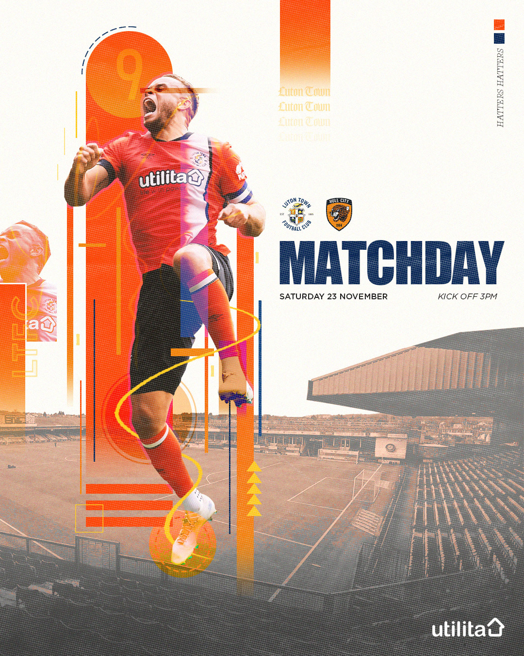
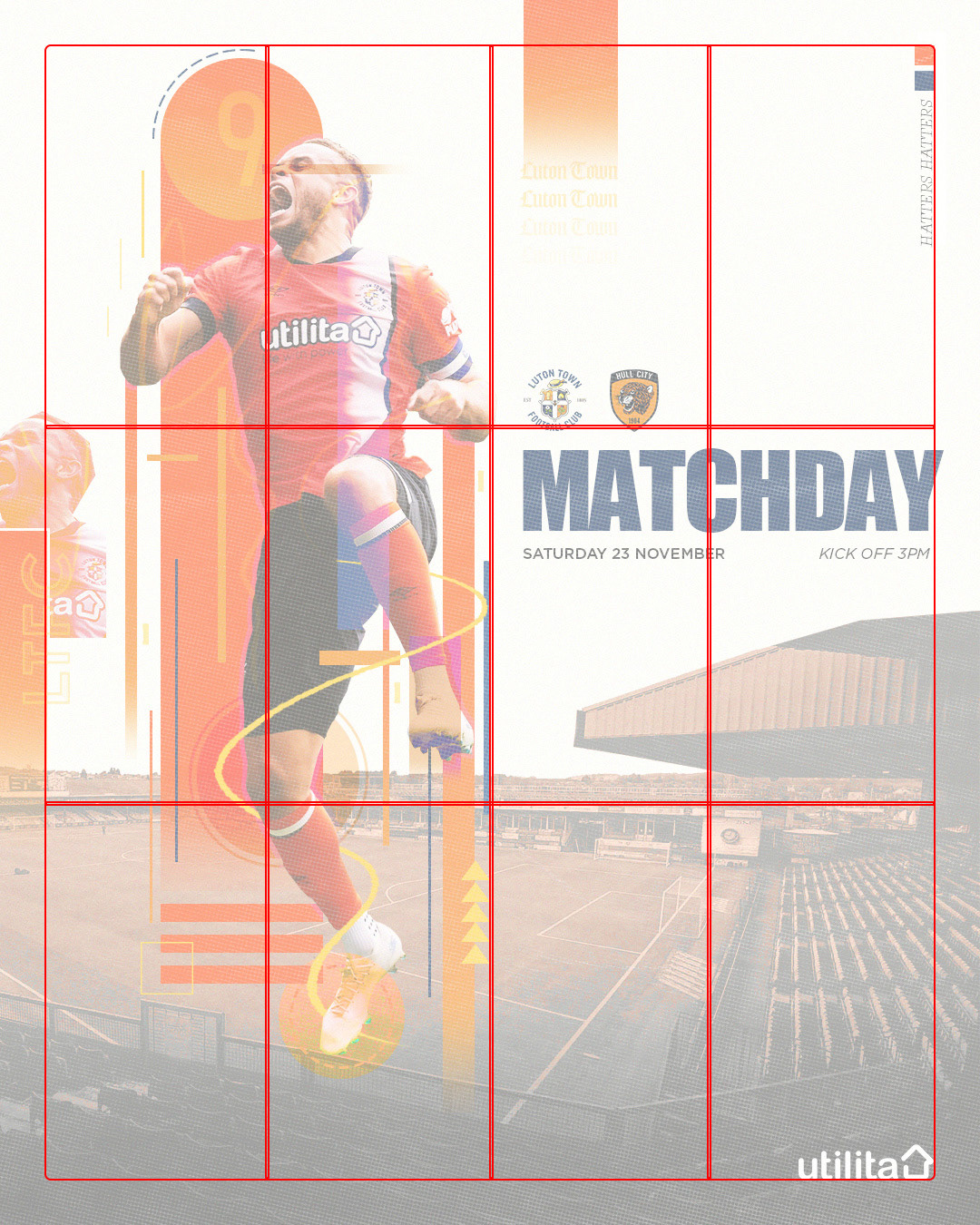
Option 2 used a 4x3 grid layout with artwork on the left and matchday information on the right. The artwork symbolises the energy generated by Kenilworth Road, energising Luton Town’s players and representing their progression from Non-League to the Premier League, supported by passionate fans."
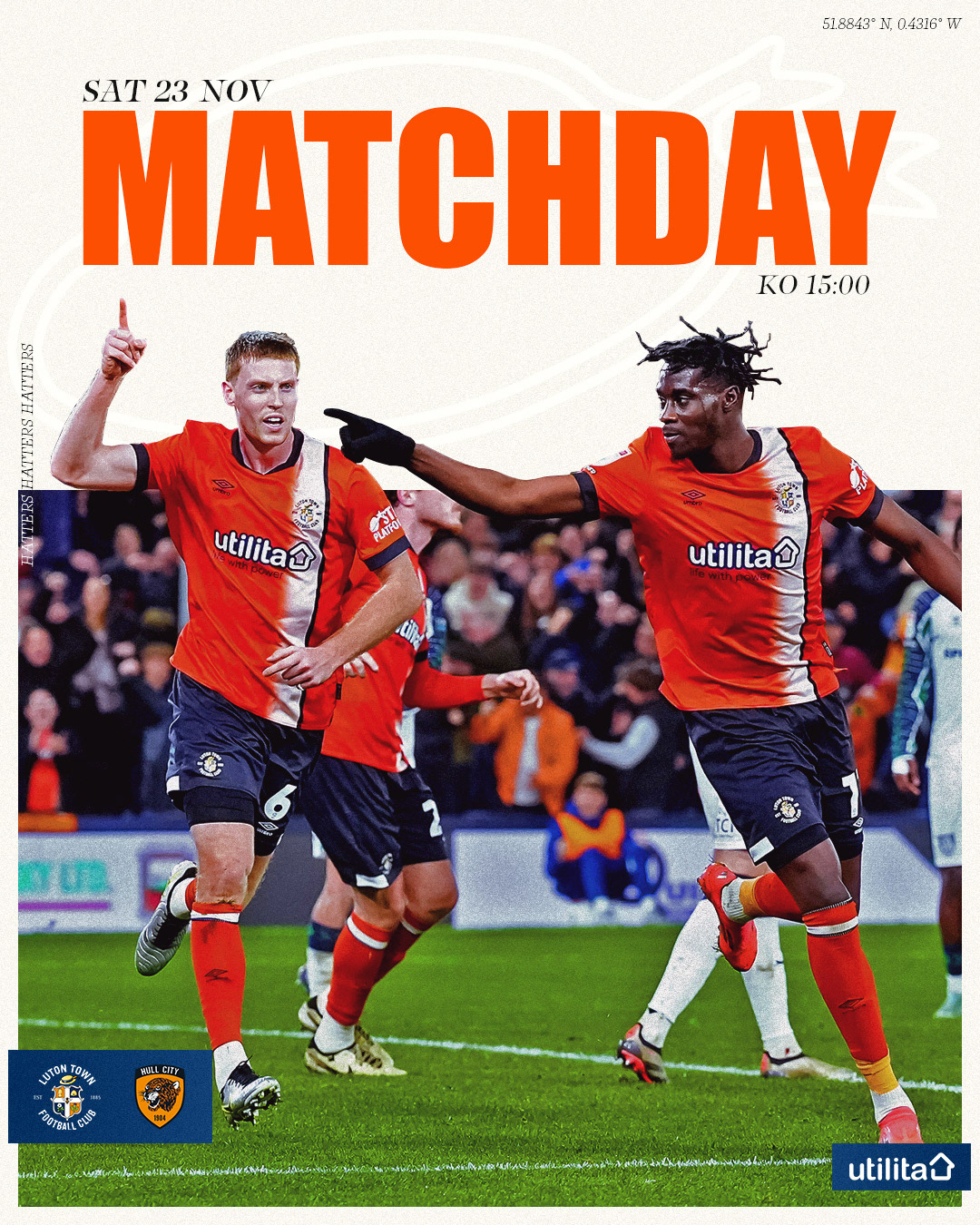
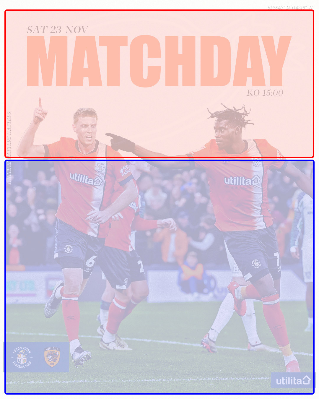
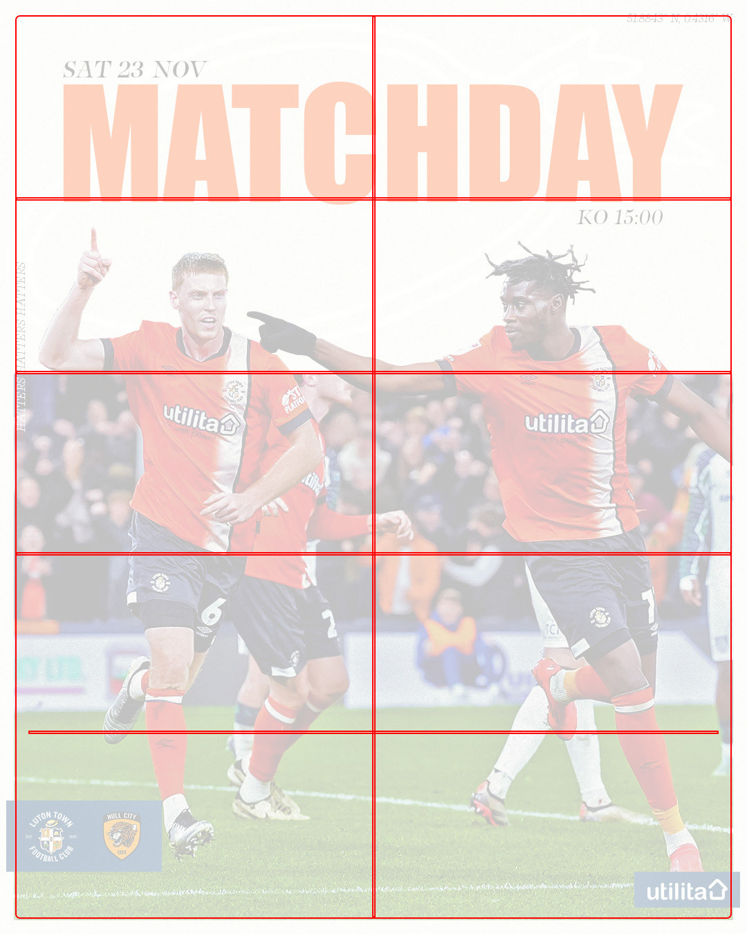
Option 3 utilised a 2x5 grid with a 2:3 ratio, balancing the graphic with imagery filling the bottom two-thirds and allowing the top third for clear, legible messaging, while the image composition naturally guides the viewer’s eye to the information.

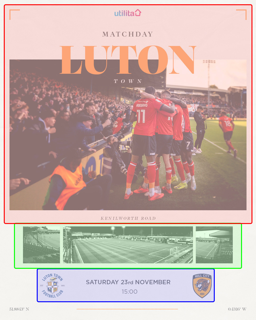

- Option 4 used a hierarchy structure, with the main artwork and matchday information as the focal point, guiding the viewer’s eye naturally down to the key matchday details.
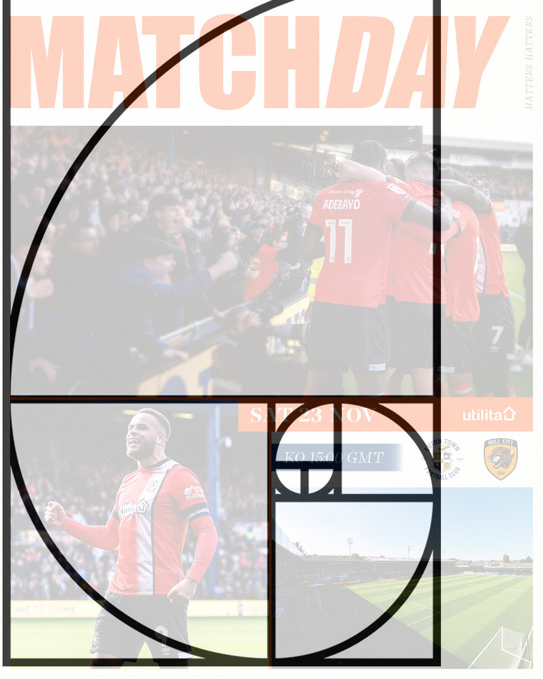
- Option 5 utilised the golden ratio with a photography-heavy design, starting with a large image at the top and reducing in size, guiding the viewer’s eye to the essential matchday information while ensuring both visual engagement and effective communication.
Research and ideation
- My research focused on how football clubs advertise 'Black Friday' sales and explored external sales and fashion designs, with the key takeaway being to prioritise typography for clear communication, supported by imagery when needed.
final outcome
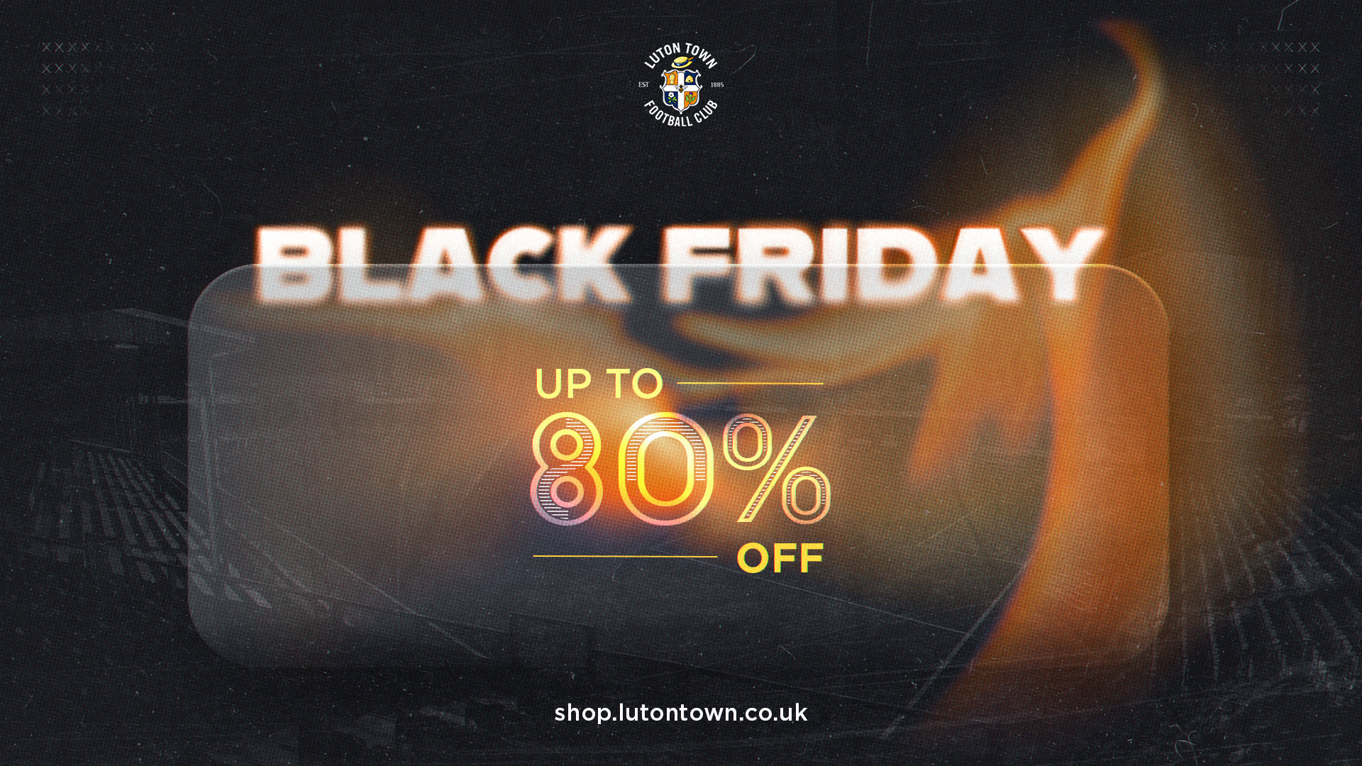
- The aim was to create a design that aligned with the club's fashion and merchandise aspect while maintaining its brand identity, focusing on communicating the '80% off - Black Friday' message with bold, centred typography and added excitement through the use of orange waves to reflect the energy of the offer.
